Check out our list of the best home page examples from around the web, and see expert tips on designing an effective page for your site.
In real estate, curb appeal is one of the most important selling features. It doesn’t matter how great a home is on the inside; if it has an ugly exterior, buyers aren’t going to want to take a closer look. The same applies to web design, which makes sense because a website is your brand’s digital real estate.
You’ll lose traffic when you drive people to your website only to have them land on a page with a poor visual design or a negative user experience. Remember, your website is the first impression of your business to website visitors, just like your home’s exterior is to people interested in buying it. Spending time creating a well-designed home page is vital. Studying excellent home page examples will help. Interested in this topic? Check out our guide with everything you need to know about AI content marketing tools!
Contents
- Purpose and Role of a Home Page
- Key Elements of an Effective Home Page
- Attention-Grabbing Headlines
- Clear Call-to-Action Buttons
- High-Quality Visuals
- A Succinct Value Proposition
- Trust Indicators
- User-Friendly Navigation
- Optimized for Mobile Devices
- Home Page Design Best Practices
- Home Page Examples
- Corporate/Business Website
- 1. ExxonMobil
- 2. Geico
- 3. Mint Mobile
- 4. Martha Stewart
- 5. Steinway and Sons
- 6. Fitbit
- 7. Zenni Optical
- 8. Verve Coffee Roasters
- 9. Tiny Organics
- 10. Magic Spoon
- 11. Twelve South
- Portfolio/Personal Website
- 12. David Milan
- 13. Kristina Smolyar
- 14. Denas Rusli
- 15. Todd’s Got a Pen
- 16. Muriel Vega
- Blog or Media Site
- 17. Just a Girl and Her Blog
- 18. Lily Pebbles
- 19. San Francisco Media Company
- 20. GroupM
- 21. NBC Universal
- Nonprofit/Charity Website
- 22. Sean Casey Animal Rescue
- 23. PL+US
- 24. World Relief
- 25. Friends of Animals
- 26. Cancer Research Institute
- Common Mistakes to Avoid on a Home Page
- Your Home Page Is Essential, so Give It Some TLC
Purpose and Role of a Home Page
Your home page plays a vital role in your online presence. First, it serves as the hub for user navigation of your site. If a user is browsing a page and is done with the information on that page, they know they can click on the header or the “home” button and return to the home page to continue their exploration of your site.
Second, it has a significant impact on your brand identity. It gives you a place to showcase your value proposition so you can tell visitors why they should do business with you or buy your product. This first impression of your brand’s identity is important because it takes just two-tenths of a second for a visitor to judge your company after landing on your home page.
Finally, a website home page is vital to your overall user experience. If it’s well-thought-out, it can serve as a landing page and guide people to the various pages of your site where they can find the information they need. It also creates the first impression of your company; if it’s done well, it can increase your conversion rate.
Key Elements of an Effective Home Page
So, what makes a home page work? Is it filling the page with fancy animations and a strong call to action? Or is it something else? Here are the things that make an effective home page work.
Attention-Grabbing Headlines

Your home page should have a headline and subheadings that instantly grab attention. This should showcase who you are as a business and how you can help them. It must be in a large, easy-to-read font prominently displayed on the page. The Cultivate Food website does this well. The entire home page is one big heading with a bold, large font that draws the reader in.
Clear Call-to-Action Buttons

Having clear call-to-action (CTA) buttons throughout the home page is essential. These tell the visitor what they should do and what action to take as a result of being on your site. A CTA button should have a short piece of text, like “buy now” or “learn more,” and they should be displayed in prominent locations throughout the page. Lifetree Creative does this well with clear CTA buttons on the home page, directing the reader to either “get started” or “learn more.”
High-Quality Visuals

Make sure the page has some visual elements, whether images or videos. However, don’t just throw some visuals up there and call it good. The best home page design will have high-quality visuals that appeal to site visitors and align with your brand’s goals. You can see a good example with the Four Seasons website. The home page has an engaging slideshow showcasing the hotel chain’s services.
A Succinct Value Proposition

Your home page needs to tell readers what your company offers them. Your value proposition should be short and sweet, but it also should be appealing. This is where your market research will come into play. What can you tell people that will make them trust you and want to do business with you? How can you tailor your value proposition to your target audience? Answer these questions, then build the value into your home page. This Is Sleep clarifies its value proposition on its home page with the headline.
Trust Indicators

Display these clearly on your home page so people can see the value of working with you. You can see this example on the American Family Heating & Air Conditioning website. Trust indicators are items on the page that will help visitors trust your company. Some ideas include:
- Testimonials
- Reviews from legitimate sites like Google
- Other types of social proof, such as Facebook ratings
- Certifications
- Awards

The user experience is a vital part of your home page design. Make sure that every component you put on the page, whether a link, a drop-down box or a sidebar, is clear and concise, showing the reader exactly where to find what they need. Pop-ups and auto-play videos can hurt the user experience, so only use these if there is a clear reason. The Music Academy in Rockford uses clear navigation on its homepage so visitors can quickly find what they need.
Optimized for Mobile Devices

Optimize your page to show up well on both desktops and mobile devices, as you will have visitors from both. Work with a website designer to ensure the page is responsive and optimized for smaller screens. If you open the Inspod website on different devices, you’ll see that it adjusts well.
Home Page Design Best Practices
As you put your home page design into effect, make sure to keep these best practices in mind:
1. Maintain Simplicity and Clarity
On a home page, less is more. You don’t want a cluttered page full of graphics. Each piece you add should make an impact, so choose wisely.
2. Prioritize Load Speed
Your page needs to load fast. Over half of all visitors will click away if it takes more than three seconds to load your page. Test, then re-test load speed, and ensure it’s lightning fast.
3. Responsive for All Devices
A responsive page will adjust between desktop display and mobile display. Make sure yours is responsive for tablet, desktop and mobile phone-sized screens.
4. Include Essential Contact Information
Don’t just redirect visitors to your contact page. Ensure your home page has your address, phone number and email, as applicable to your business.
5. Optimize for SEO
Make sure your home page is search engine friendly. You want to get organic traffic from people searching for what you offer.
Home Page Examples
The best way to make a good plan for your home page is to look at home page design examples that work. You’ll be able to see what makes a design eye-catching and how the designers built the site to maintain optimal functionality. You can then decide which designs or templates will fit best.
Corporate/Business Website
Corporations must showcase their logos and branding well on their websites. They are less focused on products, even if they sell a product, and more on their overall value proposition.
1. ExxonMobil

The ExxonMobil site works well because it has a large graphic. The graphics engage the visitor by moving through a slideshow to connect to the four main headlines. The headlines provide social proof and support the value proposition of the company’s leadership in the energy industry. The navigation bar at the top is easy to read and use, which makes a positive user experience.
2. Geico

Geico’s website works because the value proposition, affordable insurance, is clearly stated in the tagline that serves as the heading. It then displays a well-known icon, the Geico gecko, in the center of the page. Next to him is an interactive feature where visitors can select the type of insurance they need. If you scroll down further on the page, you’ll find testimonials and ratings that showcase why they are the top option for insurance. The entire page feels friendly and inviting, making you want to jump into business with them.
3. Mint Mobile

Mint Mobile has a simple design with a consistent color scheme. It also prominently features reviews above the fold. The CTA is clear and offset from the rest of the content with a colored box. This makes it simple for users to see the value and how they can sign up. The simple graphic of a customer holding a phone ties it all together.
4. Martha Stewart

Martha Stewart’s brand is known for simple, elegant designs, and the brand showcases that with the simple layout of her site. The neutral color scheme and prominently displayed photograph are entertaining. Across the top is a simple navigation bar showing the site visitor where to go and what to click to find recipes, products and information.
5. Steinway and Sons

The Steinway grand piano brand is the best in the industry, and images of the elegant instruments are prominently displayed on this home page. It also features a “learn more” CTA button prominently on the page and has an easy-to-read navigation bar across the top. The simple white background allows the images of pianos to stand out.
6. Fitbit

Finally, Fitbit, the fitness tracker creator, allows their value proposition, better health, to stand out high on the home page. Images of the fitness trackers are also showcased well here. The colors are bright but not too intrusive, and the navigation is intuitive, making a good first impression on website visitors.
E-Commerce Website
On an eCommerce site, the primary goal is to sell products. Even in the home page design, products will be prominent. Still, it will use the website design best practices to sell subtly and keep the brand’s image as a primary focus. Here are some that do it well.
7. Zenni Optical

Zenni Optical sells glasses, and that’s clear from the home page’s prominent use of models wearing glasses. However, it also uses people because people give a human side to the business. The navigation bar at the top of the page makes it simple for the site’s visitors to find the type of glasses they need.
8. Verve Coffee Roasters

Verve Coffee Roasters provides an eye-catching design that grabs the visitor’s attention. The color scheme blends well with the coffee product, and the streamlined image works nicely with the brand’s voice. If you scroll down just a little, you see some of the top-selling products prominently displayed, encouraging visitors to purchase.
9. Tiny Organics

Tiny Organics sells organic healthy baby food, displaying a happy child eating in a high chair. The unique selling proposition is the main header, promising parents they will be able to raise a healthy eater who eats healthy for life. Endorsements from well-known names touch on the pain point of many parents, which is wanting to find a food source they feel they can trust.
10. Magic Spoon

Magic Spoon makes its purpose and call to action clear on the home page. A photo of the protein-packed cereal is on the page, as is the CTA button. When the site visitor scrolls down, they see testimonials from other customers that add to the appeal of the cereal. The simplicity of the design is part of what makes this a good home page example, too.
11. Twelve South
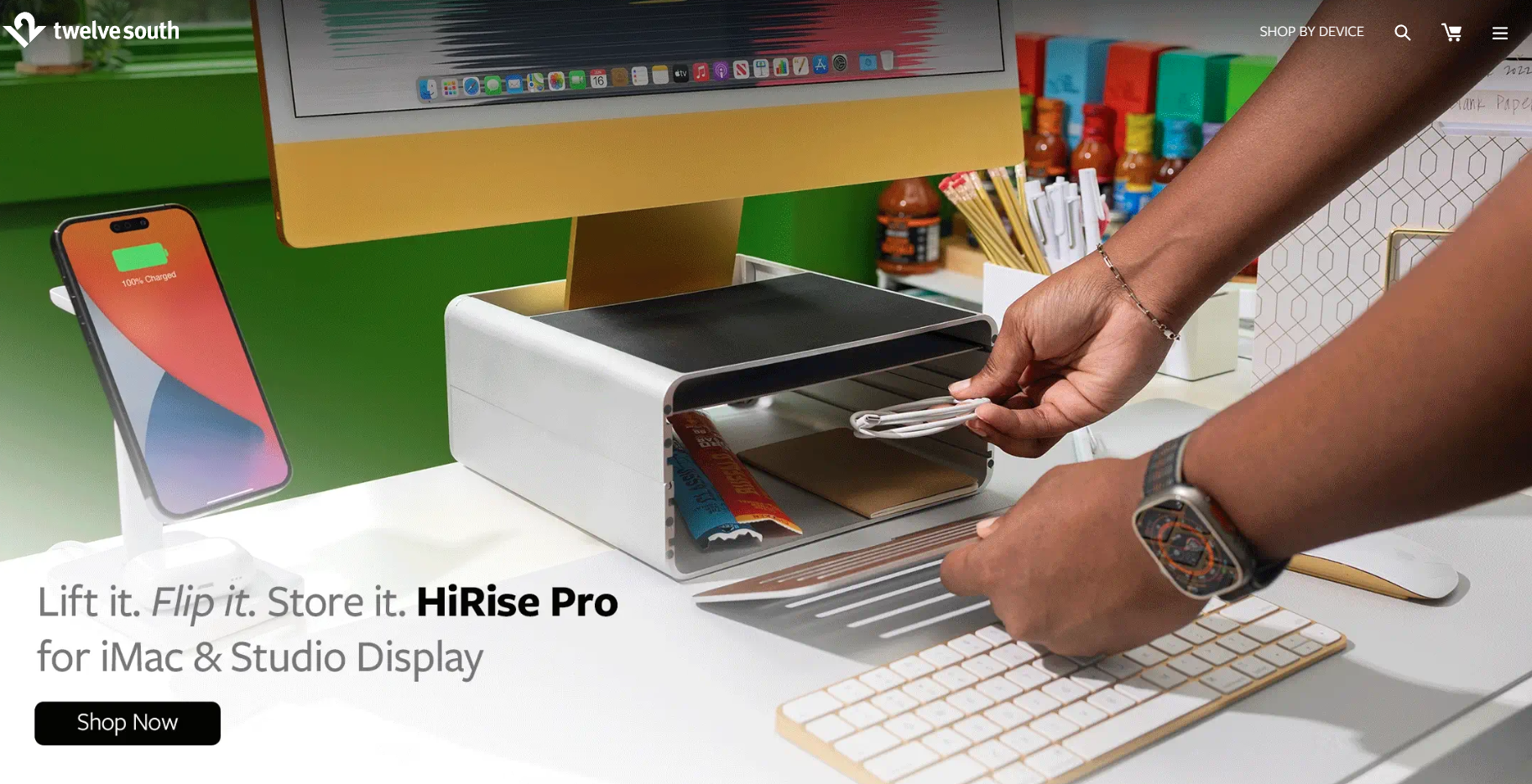
The streamlined design of Twelve South’s products is mirrored in its website layout. The home page features a simple animation that grabs attention and shows visitors how to use the product. Apple’s products are also shown throughout, which makes sense since the brand sells accessories for Apple users. Simple icons allow users to click on their device to find related products as they search for items to buy.
Portfolio/Personal Website
A portfolio or personal website gives a person or business a place to showcase their work. Images are often prominent on these home pages, as the small business needs to show what it can do.
12. David Milan

David Milan is a lettering artist. This simple home page showcases art pieces highlighting his abilities and skills well. Each one is a link to a slideshow of the same art pieces. You can instantly see the type of work Milan creates, and the drop-down menu on the side allows you to find more information about the artist, his work and his store.
13. Kristina Smolyar

Kristina Smolyar is a model who has a personal website and online portfolio. It has a fresh, clean design that allows her images and videos to stand out. Simple icons that direct the visitor to her social media pages are quite effective without being obtrusive.
14. Denas Rusli

Denas Rusli is a photographer and designer, so it makes sense that his home page features an incredibly vivid image prominently. The image changes, so no two visits are the same, but it showcases his artistic abilities. Scrolling down brings you to a list of different photography styles that feature matching images. The images lead to portfolios of those image styles.
15. Todd’s Got a Pen

Todd’s Got a Pen is the online portfolio of writer Todd Clarke. It features his value proposition front and center and a graphic that clearly shows he is a writer. When you scroll down, you see tight copywriting, indicating the value of working with a professional writer. It has a call to action button that works and an uncluttered and effective simple design.
16. Muriel Vega

Muriel Vega is a food and culture writer with an effective home page on her online portfolio. The easy navigation is what makes this site stand out. Website visitors know where to go and what to click when they open this site.
Blog or Media Site
A blog is a place for a brand to showcase its ideas less formally. Some sites are standalone blogs, and they’ll have home pages. These need clear navigation that helps readers understand the topics they want to read about.
17. Just a Girl and Her Blog

The Just a Girl and Her Blog home page does everything well. The pleasing, feminine color palette helps define the audience, while the simple navigation lets people find blog posts by category. Like many blogs, the site has ads, but they’re small and out of the way, so they don’t hurt the user experience.
18. Lily Pebbles

Lily Pebbles has a fashion and lifestyle blog that works because of its simplicity. One recent article is posted on the home page, and the upper navigation bar makes it easy to find other topics. You can also scroll down past a small blurb about her online store to see other recent and popular posts. The photography matches throughout, as well, which adds to its effectiveness.
19. San Francisco Media Company

SFMC is a media company in San Francisco. They use a city landscape photo to set the stage for their home page and then add a colorful graphic. You know instantly that they want to be collaborative in their approaches to what they do when you look at this page, and you can find the services or publications you want in the upper navigation.
20. GroupM

GroupM showcases its value proposition front and center. Its straightforward design also leads the reader to what it offers. A list of agencies in their team followed by some recent news round out the simple but effective home page that is manageable and manageable with information.
21. NBC Universal

NBC Universal uses its home page to make its three main offerings known. It has an animated slideshow that moves through the theme parks, movies and TV/sports offerings. The animations are most prominent, which makes sense when creating a home page for a media giant.
Nonprofit/Charity Website
Finally, if you build a website for a nonprofit or charity, your value proposition will become your charitable mission. The home page should prominently display this and also direct people to learn ways they can help, whether through becoming a volunteer or through financial contributions. Here are some examples of home pages that do this well.
22. Sean Casey Animal Rescue

On this home page, an adorable puppy smiles at the website visitor while the animal rescue’s mission is stated clearly. Those who decide they want to support animals or the Sean Casey Animal Rescue will find what they need at the navigation bar at the top of the page, which is easy to read and access.
23. PL+US

PL+US is a charity advocating for paid leave for new parents, both mothers and fathers after a baby comes. The mission, again, is front-and-center, and the image of a baby and caregiver appeals to that mission. Site visitors can see the button indicating they should navigate down to find out more.
24. World Relief

World Relief works to bring relief and aid to countries facing disasters. The home page features a current project prominently, inviting readers to find out how they can help. A quick scroll down brings up a video about the group’s mission. It also features some statistics on the home page that show why they are a valid organization to partner with.
25. Friends of Animals

This attractive site opens up with its mission statement. Friends of Animals also uses its home page to showcase beautiful photography of the natural world the organization is trying to protect. Three call-to-action boxes below the main content quickly get site visitors to the actions they can take to do their part to protect the animal kingdom.
26. Cancer Research Institute

The Cancer Research Institute has a team of scientists in a lab prominently displayed on the home page. This works because the main focus of this charity is medical research. The page also displays some of the organization’s history, which helps readers feel they can trust them as a charitable partner.
Common Mistakes to Avoid on a Home Page
We’ve looked at excellent examples of good home pages, but what should you avoid as you make a home page for your site? How can you keep visitors safe from unwanted and annoying features? Here are some tips.
1. Failing to Keep It Simple
The home page shouldn’t be overloaded with information. Keep things simple and straightforward, with tight copy that drives home your value proposition and overall branding goals.
2. Ignoring Mobile Users
You can’t afford to ignore mobile optimization any longer. Ensure your site works well for all users, including those navigating to it on a phone or tablet.
3. Adding Disruptive Ads
Even for a site generating ad revenue, too many ads or pop-ups that hurt navigation and user experience will hurt your home page’s effectiveness. Use ads if you need to, but make them fit in with the design and the way people will navigate the page.
4. Missing Clear CTAs
You must tell the people visiting your site what they need to do while there. Clear CTAs are essential. Ensure people are shown how to do business with you with buttons and directions.
5. Creating Slow Load Times
Make sure your website loads quickly. If it doesn’t, people will click away, increasing your bounce rate.
Your Home Page Is Essential, so Give It Some TLC
Building a website is not easy, but you need to ensure the home page is doing its job. It should be a great place for site visitors to land and see who you are and what you offer. It should also have a design that supports a positive user experience while appealing to search engines. Copywriting is also an important part of the overall picture of your website.
Does this sound difficult? It can be, but by studying some excellent examples of home pages and then investing some time in building and testing designs that you think will work well, you can land on a final design that will deliver. Finally, don’t forget to test your home page thoroughly for effectiveness. Perform user tests to see what works and what doesn’t. Give yourself the time to build, test and tweak, and soon you’ll find exactly what works for your business, your site visitors and your website.
Looking for more? Check out our guide on social media marketing for beginners!