Is it time to tackle the About Us portion of your website? We’ve got all the About Us page examples and tips for introducing your business and team to clients and potential new customers.
Writing the About Us page for your profile or business can be daunting. After all, we all know how important it is to make a great first impression. It can be tricky figuring out just how much information to include without risking losing the visitor’s attention. Using some of the best writing apps can help you create a stand-out About US section.
How important is including the company’s history, for example, and are flashy elements like interactive timelines effective? One thing’s for sure: your About Us page needs to reflect your business’s values, mission, and USP. Plus, it must be readable, engaging, and draw the reader in, keeping them on the site for as long as possible.
This may all sound like a pretty hefty task, but there are many ways to make this virtual first impression count. Check out the About Us page examples here for inspiration on the best approach for your unique business.
Contents
- About Us Page Examples
- 1. Boonshoft Museum of Discovery
- 2. The Hershey Company
- 3. Nissan USA
- 4. WWF
- 5. Basecamp
- 6. LessEverything
- 7. BarkBox
- 8. Trader Joe’s
- 9. HubSpot
- 10. Ruby Love
- 11. Dave
- 12. Uber
- 13. Collective Retreats
- 14. WordPress
- 15. Mailbird
- 16. Lonely Planet
- 17. Truvani
- 18. Vidyard
- 19. Eight Hour Day
- 20. Below the Fold
- 21. Bulldog Skincare
- 22. Hydrant
- 23. Clearcover
- 24. Pick Up Limes
- 25. Moz
- 26. Mailchimp
- 27. Headspace
- 28. Citizen
- About Us Page Writing Tips
- 1. Keep it Simple
- 2. Get Personal
- 3. Provide Links
- 4. Add a Call to Action
About Us Page Examples
1. Boonshoft Museum of Discovery
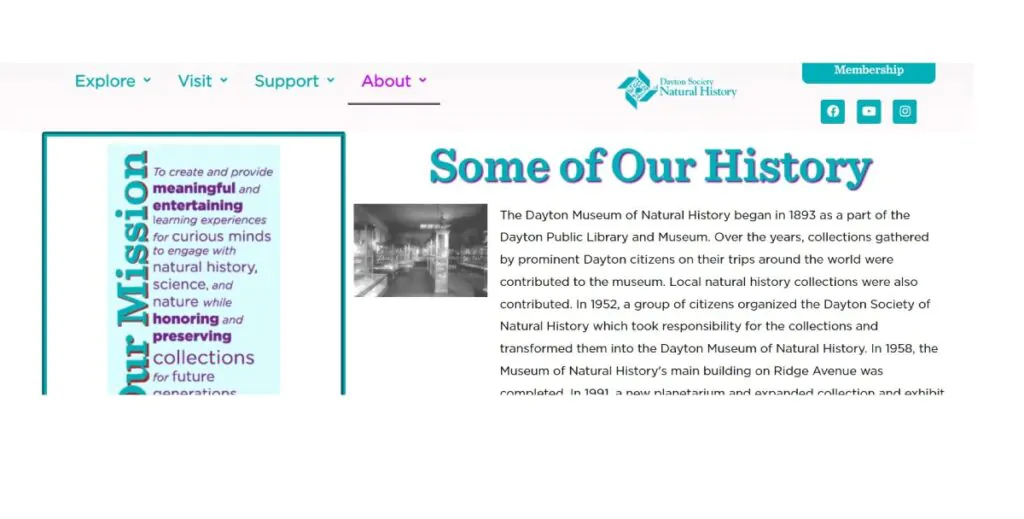
Boonshoft Museum of Discovery is a children’s science and history museum in Dayton, Ohio, that does a great job of helping visitors learn more about the company’s mission and history and what it offers young children and adults. The company’s About Us page also offers updates on the latest changes at the museum through a newsfeed featured on the site. This allows visitors to learn about forthcoming and current events and news without scrolling to a new page.
Boonshoft features lots of information on its About Us page, including the company’s history, mission, and vision. Plus, visitors can also view the accreditations the museum has achieved through the years. This page doesn’t just tell potential visitors more about the museum and builds trust by providing viewers with all the information they need.
“Mission – To create and provide meaningful and entertaining learning experiences for curious minds to engage with natural history, science, and nature while honoring and preserving collections for future generations.
Our Vision – To be the leading regional destination where people engage with global natural history, science, and nature.”
Using its About Us page to outline its mission and vision immediately and clearly, the museum conveys its brand values and communicates what potential visitors can expect. The page design allows the reader to continue learning about the company’s history at the bottom if they fancy finding out more.
2. The Hershey Company
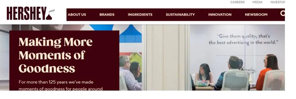
The Hershey Company has several projects beyond the sweet treats sold in supermarkets. From charitable endeavors (such as a not-for-profit school created by the company’s namesake) to a commitment to including the community in the company’s success to a massive theme park, The Hershey Company is multi-faceted. “Share Goodness” is Hershey’s motto, and focusing on ethical practices and sustainability is at the heart of company culture.
The About Us section of The Hershey Company’s website incorporates excellent web design that allows potential customers and visitors to get the information they need without being overwhelmed by all the company offers. The page begins by providing simple information on the company’s history and brand story. Hershey’s core values are evident as readers scroll through this information. The interactive site allows visitors many options to learn more by clicking on links to access details on the history of Hershey. This impressive tale includes current charitable projects and information on the leadership team.
“The Share Goodness Promise – The Share Goodness Promise is an idea as simple as it is big: our business, our planet, our communities, our children—they’ve always mattered. It’s a promise delivered by all of us at Hershey—to see every day as a chance to be successful in a way that makes a difference.”
Hershey’s About Us page effectively offers small, digestible snippets that share different aspects of what the company provides, inviting the visitors to click at their leisure. SEO is hard at work on the site without being obvious. This is a sign that the company has put time and effort into copywriting the site in a way that makes it rank highly with popular search engines. Which means more organic traffic is driven through its virtual doors.
3. Nissan USA
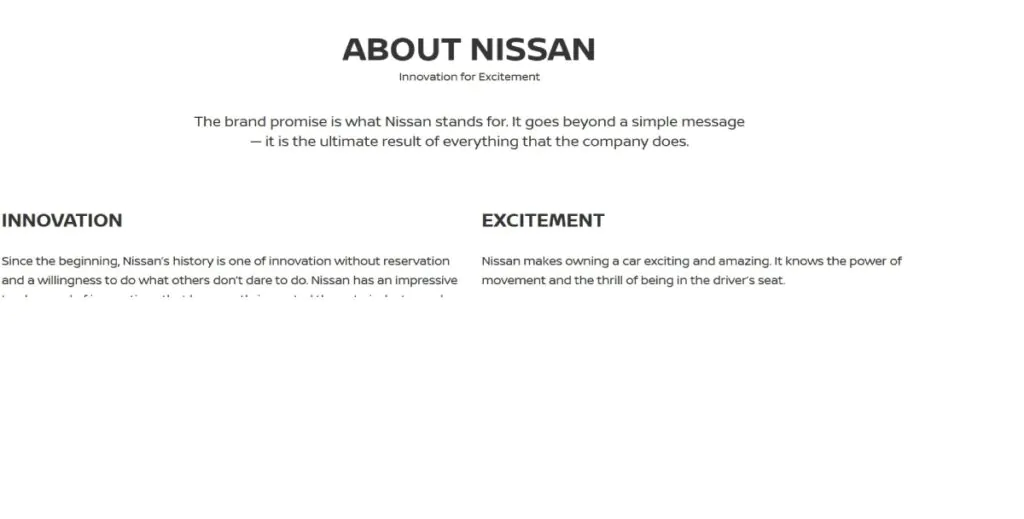
Much like The Hershey Company, Nissan USA is a giant corporation that’s done an excellent job creating an About Us page. This example utilizes the latest digital marketing techniques combined with an eye-catching design. The result is a page that draws in site visitors, making them want to learn more about the company. The page template is clean and easy to read, without large blocks of text that can tempt site visitors to skim. The brand promises “innovation for excitement” above all else and makes this mission clear immediately on its About Us page:
“INNOVATION – Since the beginning, Nissan’s history is one of innovation without reservation and a willingness to do what others don’t dare to do. Nissan has an impressive track record of innovations that have greatly impacted the auto industry and the lives of drivers worldwide.
EXCITEMENT – Nissan makes owning a car exciting and amazing. It knows the power of movement and the thrill of being in the driver’s seat.”
Following these dynamic explanations, site visitors can click on several images that bring them to pages providing more information. Links below the “innovation for excitement” promise include corporate info, green program information, heritage, the Nissan college grad program, and the Nissan owners portal. There are also more details on diversity, careers, news updates, and an explanation of what the Nissan Technician Training Academy offers. Having page features set up this way allows visitors to get the information they need and creates a highly usable and engaging experience.
4. WWF
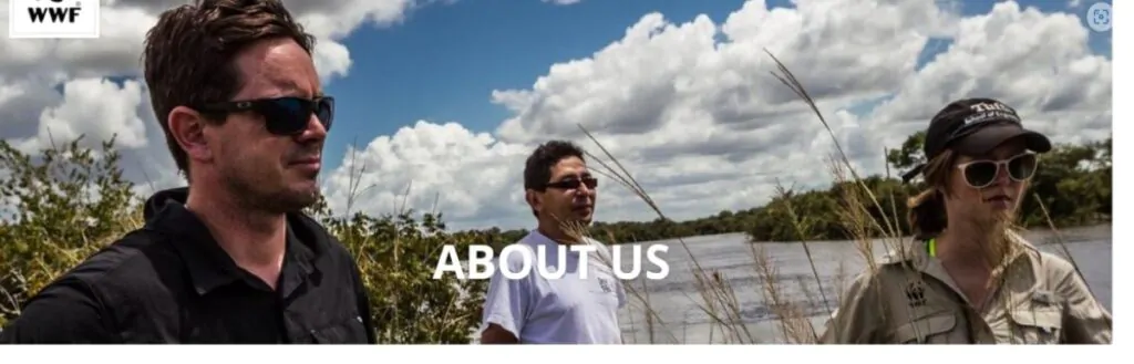
WWF (World Wildlife Fund) offers something of a master class regarding About Us Pages. Bright, eye-catching photographs, perfectly sized blocks of text, and easy-to-identify links take the visitor on a voyage of discovery. After briefly establishing the company’s credentials, the mission statement rings clear: “For Nature, For People, Forever.” Within a few seconds of arriving on the About Us page, we have a perfect sense of what the organization stands for, its origins, and its goals. An on-page quote from the president and CEO of the WWF neatly summarizes their goal:
“Conservation endures as a living discipline because it is inhabited by a magnificent collection of people. Only by working together can we create solutions to the most vexing problems we face.”
WWF (World Wildlife Fund)
This About Us page demonstrates how high-quality design and clarity of message are powerful allies. After clear Who We Are and How We Work sections, visitors can click on links, each accompanied by an image and with text in different colors, to sections including Climate, Food, Forests, Freshwater, Oceans, and Wildlife. Below this is a range of boxes, each boasting stunning photographs, where readers can access additional information.
More can be discovered about the history of the WWF, the experts working with and on behalf of the organization, and its leaders. There are also further links to the newsroom to find information on the company’s safeguarding policies and financial reports.
The call to action comes at the bottom of the page, and it’s a sucker punch. After reading and viewing pictures of the important work of the WWF, the visitor is told: “You can help build a future where people live in harmony with nature. Make your donation today and support WWF’s conservation solutions.” Below this is a Donate Now button, and a photo of a bear cub accompanies the text to reinforce what’s at stake.
5. Basecamp
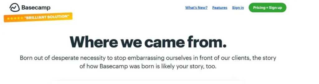
The most important element of an About Us page is making your company personal so potential new clients can connect with you and get a real sense of your organization’s value proposition. Basecamp’s About Us page is a stellar example of this. It offers a no-nonsense, straight-to-the-point introduction that makes the reader feel as if the company has got its back.
The company’s co-founder and CEO write the text and tell Basecamp’s origin story.
“We built Basecamp out of desperate necessity.”
Basecamp
Such honesty is refreshing and powerful, grabbing and engaging readers’ attention. The page describes why the company’s product was needed (an innovative project management platform), what problems it solves, how the team built it – and, crucially, why you need it in your life.
Towards the bottom of Basecamp’s About Us page, readers will find a link to more details concerning the product (as well as information on a free trial). There’s also the CEO’s direct contact details: a nice touch to amp up the personalization further.
6. LessEverything
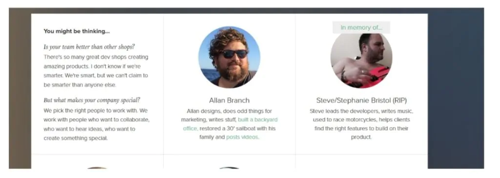
There are a near-infinite number of development and design companies out there, but LessEverything stands out from the crowd with the help of its fun and user-friendly About Us page, which emphasizes the people at the heart of the business. The page sets out its stall straight away at the top. What makes this team different from all the others in its field? What makes the company special? The answer: “We pick the right people to work with. We work with people who want to collaborate, who want to hear ideas, who want to create something special.”
The message is clear: this team wants to work with you, not just for you, to create your digital vision or help fulfill your business goals. The About Us page also features headshots and short, humorous bios of staff members. Below this, visitors can access videos created and posted by some team members on their three favorite things of the week. The great thing about this is that it helps create a personal connection with the audience and allows the staff to show off their video-making chops.
LessEverything’s About Us page demonstrates how using humor and steering clear of industry jargon can go a long way when making a sparkling first impression.
7. BarkBox
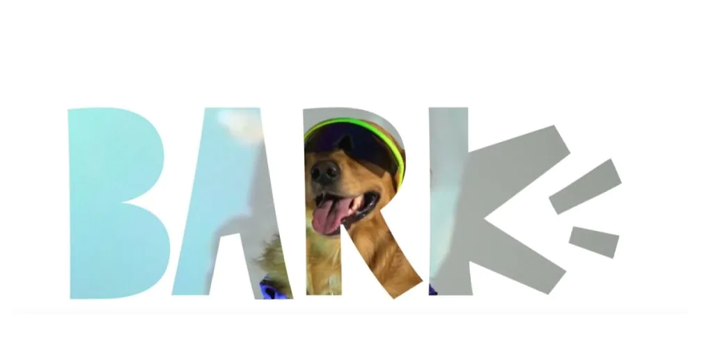
BarkBox’s mission statement is writ large at the top of the company’s About Us page: “Making Magic for All Dogs and Their People”
The page is neatly categorized into the company’s four key product offerings: BarkBox, Super Chewer, Dental, and Food. Visitors can click on each box to access more information. There’s also a link to find out more about the team behind the brand and buttons to click, which will take readers to pages on careers within the company and for press information.
BarkBox understands that its target audience is pet owners keen to show their furry friends how much they’re loved. To this end, the company will surely include details on its About Us page about the community and advocacy work it undertakes to give all dogs a happier life. This work includes surrender-prevention community services, responsible re-homing and sourcing, and providing resources and education.
Using your company’s About Us page to demonstrate that you don’t just talk but walk the walk is always a great idea to boost engagement, enhance trust, and validate your business’s ethical credentials.
8. Trader Joe’s
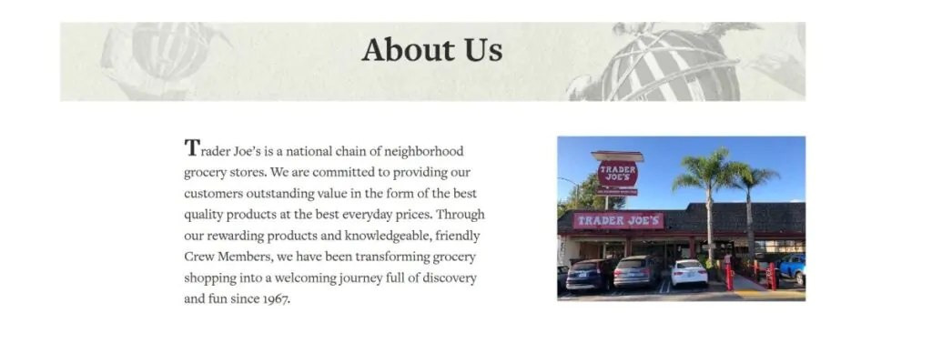
Trader Joe’s About Us page works hard to encourage visitors to visit one of the company’s chain of national grocery stores – and the company’s story is a key element. The page deploys a mixture of photos of Trader Joe’s outlets and vintage images and reminds the reader that this is a company with an impressive heritage. The business has been operating since 1967 and remains committed to providing a fun shopping experience for its patrons today.
This user experience is an inherent part of the Trader Joe’s brand, and the About Us page is an opportunity to get this across to website visitors. The page clearly explains that the company is committed to providing its shoppers with a wide range of won’t-find-elsewhere products at great prices.
This About Us page takes the opportunity to list the exact means by which it delivers good value. This includes, for example, buying direct and in bulk from suppliers, keeping overheads low, and not charging suppliers’ fees.
Rounding up this page are links to the company’s newsletter, podcast, and recipes page, giving visitors and potential new customers the chance to continue to engage with the brand and find relevant or interesting information.
9. HubSpot
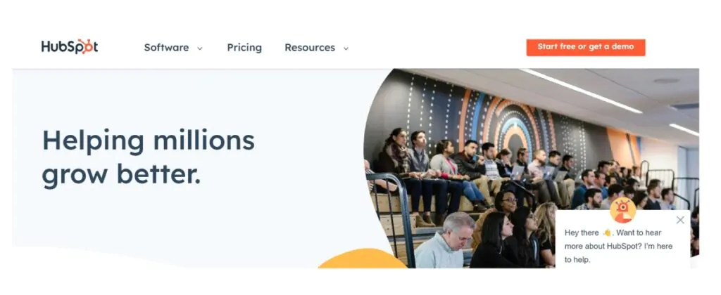
The popular CRM platform HubSpot, via its About Us page, leaves the reader in no doubt what the company is all about: “Helping millions grow better.” The page spells out the HubSpot mission and includes photos of the company’s co-founders.
Next comes the ‘Our Story’ section, which gives readers some background on the birth of the business and what continues to be important to it today. Scrolling down, we next come to an interactive timeline that takes us on a journey from when HubSpot opened its doors in 2005 to the present.
From here, it’s a seamless scroll to the details of the company’s CRM platform and the various hubs on offer. Readers can click on an array of boxes for more information on the Marketing, Sales, Service, CMS, and Operations hubs.
10. Ruby Love
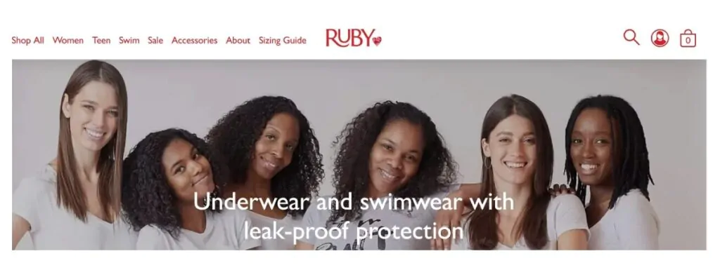
Ruby Love offers leak-proof swimwear and underwear for women and girls to wear during their period. Landing the About Us page, we instantly see a large image of a group of smiling women, along with the text: “No tampon required. Period.” Clever! We’re instantly drawn into the proposition, and pretty much any woman who experiences periods will want to read on.
The company uses a video on its About Us page, giving the viewer additional information about how the product works and how it’s helping real people. Adding a video to your About Us page could be great. Offering a mix of content is a good way to add value and interest to your site. Providing a case study or two is also an effective means of getting across your product or service’s USP.
Ruby Love’s About Us page contains information on the technology behind its leak-proof garments and how they can help wearers. The page rounds up with the personal story of Crystal Etienne, the company’s founder, tracing the path that led her to create the product that’s now a best-seller in the US and beyond. This About Us page is a perfect example of the importance of structure when designing this element of your website, and how this is vital to keep your viewer engaged and reading.
11. Dave
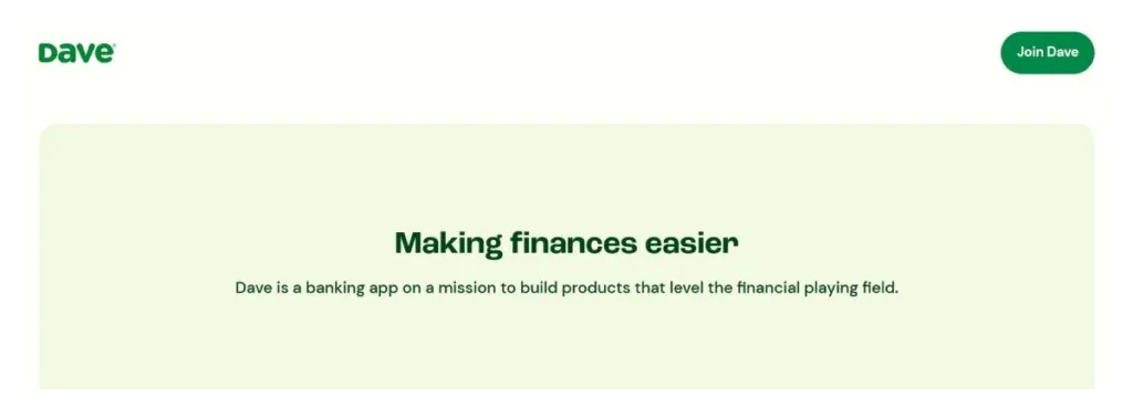
One of the biggest challenges of designing an About Us page is creating enough interest (both visual and textual) to keep the reader – reading. You likely have just a few seconds to impress a visitor enough to keep them on the page, so literally every word and image counts.
The banking app Dave is on a mission to help make day-to-day finances easier for its users. The styling of its About Us page is simple and fun, with bold block colors, eye-catching images, and columns adding to the interest level and keeping us scrolling through the content.
Headline text breaks up the content, highlighting the key values of the company:
“Our first fight was to make overdraft fees a thing of the past by spotting members the money they needed, without charging them $38. Why? Because it’s the right thing to do.”
Dave
As well as offering an insight into one of the benefits of signing up for this app, this statement also highlights how the company offers a different financial service. It’s one that’s based on morality and ethical treatment of its customers. To reinforce this, the page also clearly lays out Dave’s guiding values and provides a link that viewers can click through to find more information on joining the team.
The all-important call to action comes at the bottom of the page, with a Get Started Today button and a reminder that doing so could net you up to $500.
12. Uber
Uber has upended the world of transport, becoming the go-to means of grabbing a lift in multiple countries around the globe. The company has put a lot of thought into designing its About Us page, and it’s paid off.
The header is a summary of Uber’s mission statement and raison d’etre. This is followed by an image of the company’s CEO and a link to his full letter to the audience, setting out the team’s commitment to helping everyone, everywhere, get where they need to go. It’s a great start: large corporations risk becoming de-personalized, with CEOs who are worlds apart from everyday users. Uber’s About Us page effectively tackles this, directly connecting readers with the guy at the top of the company pyramid.
Scrolling down, the visitor can find information on the company’s commitment to sustainability and blueprints for its longer-term vision, such as removing barriers to healthcare and creating new freight booking solutions.
The About Us page also incorporates information on the overarching culture of Uber, including a commitment to diversity and the importance of acting with integrity. The company’s newsroom, blog, and information on investor relationships can also be accessed from here. Uber’s About Us page neatly demonstrates how this part of a website can be used not just to divulge the history and mission of a brand but its future trajectory, too.
13. Collective Retreats

“Travel for the collective good” is the tagline of this eco-centric company that offers a stunning selection of luxury hospitality options with a difference. The Collective Retreats About Us page design features two columns with interchanging blocks of text and images, making it easy for the visitor to read.
The page starts with a praise of the company’s main aims and status as the first global hospitality brand to receive B-Corp status. This segues into information on how Collective Retreat is improving the industry, such as partnering with the Arbor Day Foundation and making environmental impact a key element of all company decision-making.
To make things personal, there’s also a section detailing Collective Retreat’s team members, with links to learn more about each individual and their role within the company.
14. WordPress
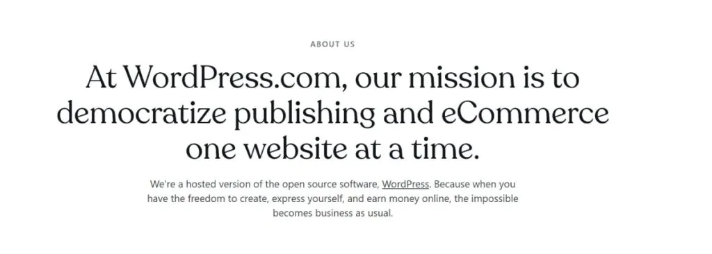
As one of the most popular website-building platforms in the world, it’s no surprise that WordPress knows what it’s about when designing an About Us page. And we can all learn a lot from the minimalist design, which nevertheless packs a punch.
The company’s mission is made clear in the page header:
“At WordPress.com, our mission is to democratize publishing and eCommerce one website at a time.”
WordPress
Following this is a small section where the company’s ethos and offerings are summarized, such as WordPress’s concern with creating a better internet where everyone has a voice and ownership of their content. The About Us page also contains some key figures and stats, such as how many page views of WordPress sites are racked up each month (the answer is a staggering 20 billion if you want to know), along with brief information about custom domains, security, speed, and upgrades, with links to access more information on each.
In today’s fast-paced, short-attention-span world, often less is more when creating an effective About Us page.
15. Mailbird
An About Us page is no place for modesty, as demonstrated by this one from email client Mailbird. After a headline round-up of what the company stands for and why it’s the best email client around, the company has won a row of accolades and awards over the years. These include Most Popular Mail Alternative from Lifehacker in 2020 and High Performer from G2 in 2023. This is an excellent pointer for those building their own About Us pages. Don’t be shy about making any industry awards or community accolades (however big or small) a prominent part of your page.
As well as a link to learn more about the company, visitors can also read some condensed blurb about the key benefits of using Mailbird. You can learn about its ability to seamlessly integrate with existing workflows and see snapshots of the leadership team.
It’s not just a CTA that can be found at the bottom of the page; there’s also a clever ticker keeping track of how many times Mailbird’s software has been downloaded just to get the FOMO going. At the time of writing, it was 3,653,470 times.
16. Lonely Planet
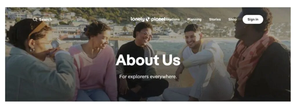
“We believe that travel is for everyone. It helps us learn about ourselves and the world around us.” This is the first line of text on Lonely Planet’s About Us page and is a perfect, concise way to let the reader know what the company offers and stands for.
The page details how the company’s ethic is harmonious with that of its readers. Lonely Planet, it says, is on the same journey as us. It emphasizes this by laying out its core values and vision, which include:
“We believe travel can help foster the connection and understanding that makes meaningful moments possible…whatever your background or needs and no matter where you want to go, we are here to power your journey. We must equip travelers with the knowledge to make informed choices about their impact, and inspire them to travel with generosity.”
Lonely Planet
The About Us page also links to other web pages, including Elsewhere, a community of local experts and travelers.
17. Truvani
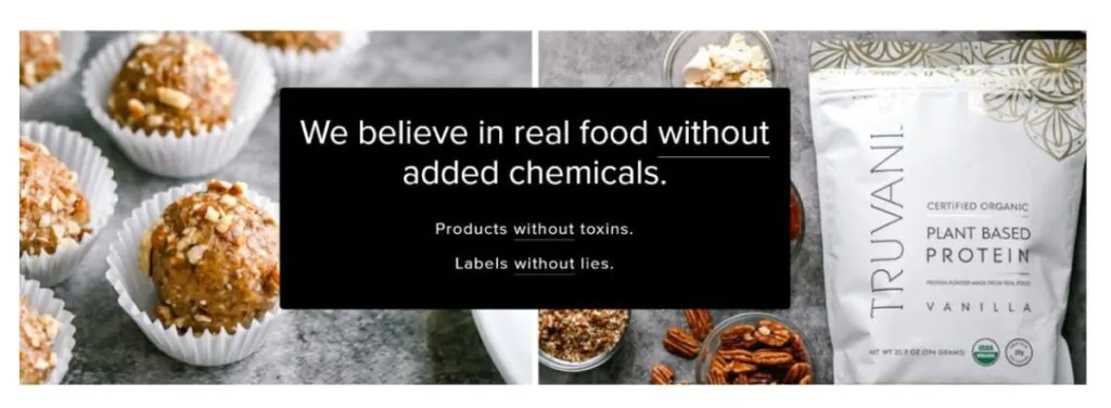
An About Us page doesn’t need to be limited to company details and testimonials: it can also be a chance to boost conversion rates and get sales. But the key is keeping things subtle. Truvani, a company that creates food and health products without toxins and added chemicals, does just this. First, the page lays out its stall (“Be the change you wish to see in the world”) and briefly explains how it ensures its food is of the highest quality possible before providing links to buy its products.
Readers will also find a gallery of staff members and headshots, allowing us to put faces to the brand. Things wrap up with a further CTA, asking visitors to hit the button to sign up and access a discount on the products on offer.
18. Vidyard
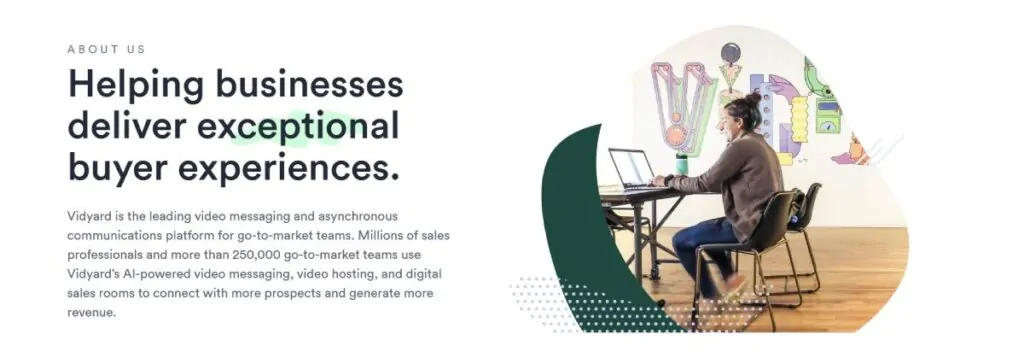
Thinking about deploying a chatbot on your About Us page? Take a look at Vidyard’s page for some inspiration. A chatbot appears when you click on the company’s About Us page. But rather than simply asking whether it can help, you’re presented with a range of options to click on, such as Can I Chat with Someone? Can I Watch a Quick Demo? or I’m Just Browsing if you want to be left in peace to look around?
Chatbots can be impersonal and generic, but this video messaging and communications platform bucks the trend by creating a highly usable, engaging chatbot that guides the visitor rather than getting in the way.
19. Eight Hour Day
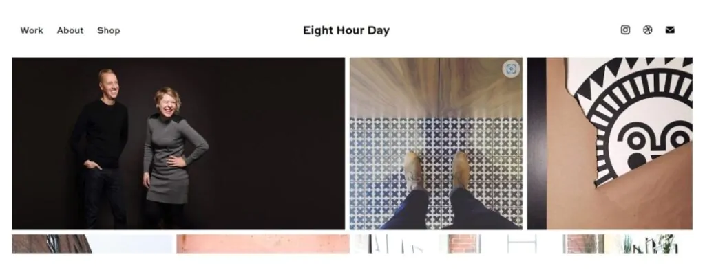
Eight Hour Day is a creative design studio, so who better to turn to for a stylish, functional, and unique take on an About Us page? The header is full of stunning images taken by the company’s two-person design team and founders, providing an excellent showcase of their talents and what prospective clients can expect from the pair.
The company’s mission statement is a simple one:
“We believe in the transformative power of illustration and design and their ability to simplify communications, elevate experiences, engage and inspire people everywhere. Let’s make something beautiful together.”
Eight Hour Day
Apart from some simply laid out contact details at the foot of the page, that’s it. This is a great example of a minimalist About Us page that is clear, to the point, and striking.
20. Below the Fold
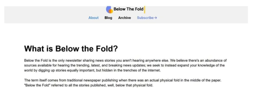
Given that Below the Fold is about sharing news stories that readers are unlikely to encounter elsewhere, it’s no surprise that its About Us page is a no-nonsense, well-written, plain-speaking affair that gets straight to the point.
There’s a quick introduction about what Below the Fold is and who it’s aimed at, and then a brief run-through of the company’s key values: Controlled Context, News Wellness, A Move to Action, and Sustainable Growth. And just to underline the company’s mission statement, it uses the page to make two promises:
“You will never see more than one sponsor per newsletter” and “All stories, including sponsored ones, are selected, written, and directed by our editorial team.”
Below the Fold
After a quick textual introduction to the team, there’s a crisp CTA: “See for yourself” above a signup box.
21. Bulldog Skincare
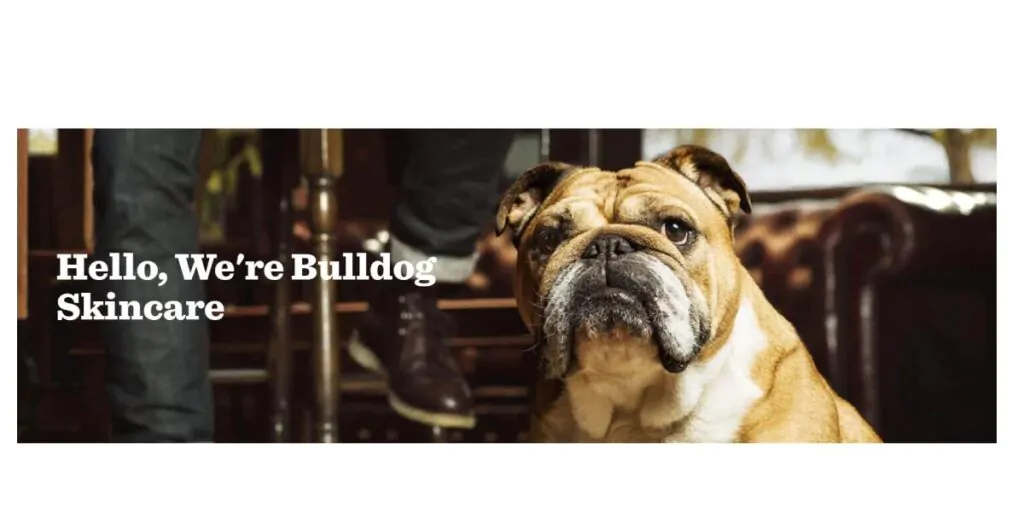
Keeping the branding and brand message strong and consistent throughout all your company’s web pages is vital, and this is just as true for your About Us page as elsewhere on the site. Look to Bulldog Skincare for inspiration on this score. Its About Us page is headed up with a cute picture of a bulldog and a simple greeting: it’s almost impossible not to scroll down.
Part of a successful business’s branding is developing a recognizable brand voice that reflects the brand and resonates with its target audience. Bulldog, which produces skincare products for men, has got this spot-on. This is enhanced by consistent images, colors, and overall visual styling, which promotes familiarity, trust, and, most importantly, a great conversion rate.
22. Hydrant
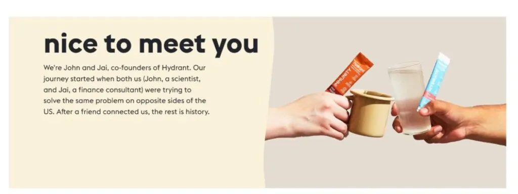
Hydrant offers wellness solutions in the form of a range of drinks. The company’s brilliantly designed About Us page keeps readers scrolling and engaged via chunks of easily digestible text with hooks that make us want to know more. Think of it like a story constructed with a series of cliff-hangers.
After an introduction to the brand and the founders behind it, we’re led to The Problem (dehydration and its effects) and then introduced to The Hero – the electrolytes contained in the company’s products. The tale is accompanied by fun photos of founders Jai and John and concludes with their twin signatures and the company’s promise: Never be thirsty again.” For added visual interest, there’s also a ticker halfway down the About Us page, providing key product details, such as Backed by Science and No Artificial Sweeteners or Stevia.
23. Clearcover
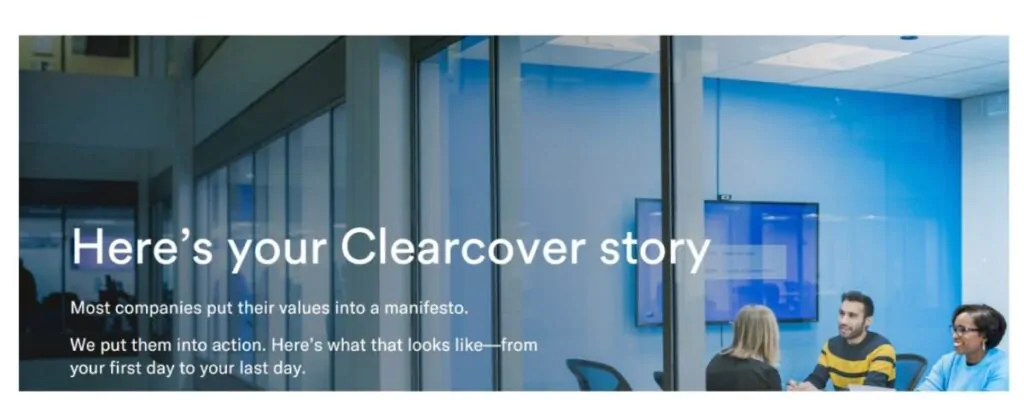
Clearcover divides its About Us page into clear sections, using a balanced mix of text, images, and white space to keep things readable and help visitors move around to find the information they need. The page works through five sections: Beginning, Challenging, Evolving, Leaving, and Creating. Interactive chapter markers at the top of the page allow readers to move between sections quickly.
Typically, interactive elements boost visitors’ time on a page or site. So, if you’re using an About Us page template, choose an option that allows you to incorporate interactivity to enhance engagement. There are also links to video content on Clearcover’s About Us page, which is, again, something that can keep readers on the page and help them connect with a brand.
24. Pick Up Limes
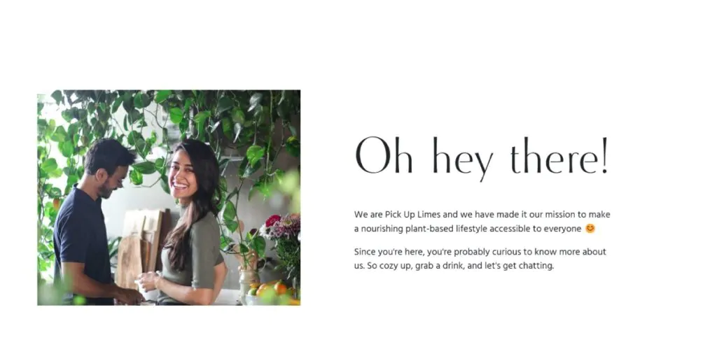
Kicking off with an engaging “Oh hey there!” Pick Up Limes About Us page has an on-message, friendly, breezy tone that makes the reader feel like chatting with a friend. Readable text blocks and accompanying images tell the brand story and timeline, recounting how the founder’s transition to veganism inspired the company, which aims to make a plant-based lifestyle accessible to all.
Incorporating an FAQ section to your About Us page can effectively give visitors the answers they need and remove any possible barriers that could otherwise undermine your CTA. Pick Up Limes has an extensive FAQ section covering everything from what supplements are recommended for vegans to how to join the company’s team.
25. Moz
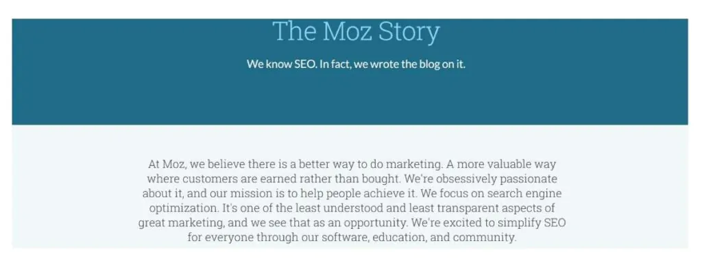
Marketing and SEO specialist Moz takes a slightly different approach with its About Us page. Following a summary of the company’s goals and mission, there’s an exploration of the company’s history. But this history isn’t just a linear progression of triumphs: it also includes incidents when an experiment failed and when, for example, Moz had to reverse a planned expansion.
The upshot of this approach is that, as the audience, we feel better connected with the company. We all know what it’s like to try and fail, and reading that Moz has experienced this too – and is honest enough to be upfront about it – convinces us that this company is transparent and trustworthy.
26. Mailchimp
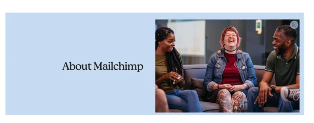
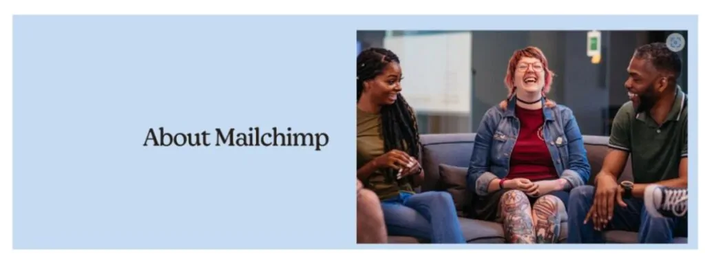
As an automated email and marketing platform, Mailchimp needs an About Us page about the personal approach. After all, prospective clients may be concerned that automation tools could spell a disconnect from customers.
Mailchimp uses a storytelling structure on this page to keep people at the forefront of its brand, relating the story of the company’s founding and what it continues to stand for and believe in. There are readable text blocks on the Mailchimp culture and corporate citizenship and links at the bottom of the page to the company’s newsroom and to access information on new products. This helps to encourage visitors to continue to explore the site.
27. Headspace
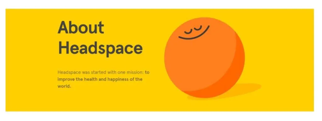
Headspace is a company all about helping people feel better through mindfulness and meditation. The use of bright yellow and orange colors and the ambiance of space and peace embodied by its About Us page are perfect for conveying their message.
The visual elements are consistent, clear, and simple, with the smiling clouds, suns, and thought bubbles adding some gentle fun. The page incorporates short sections on who Headspace is, why it exists, and what it does. It then moves onto a more detailed – but still highly digestible – discussion of how the statement aims to make mental health support more accessible to everyone. There are also some stats on how many people are using the platform and a gallery of the company’s staff members before a powerful CTA at the bottom of the page.
28. Citizen
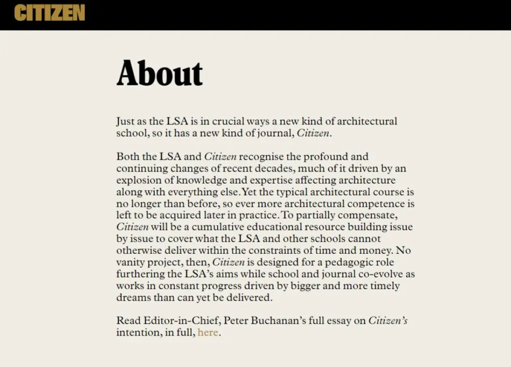
Citizen is an online educational resource. Its About Us page is spare, erudite, and to the point, reflecting the publication’s content and tone. It gives visitors an accurate idea of what they can expect from the resource. The typography is bold and clear against a neutral background, calling to mind ‘vintage’ newsprint and suggesting Citizen’s history and pedigree.
Made up of just three paragraphs, this About Us page neatly sets out the reason for the resource’s existence and its aims and concludes with a link to an essay from the Citizen’s Editor-in-Chief, which expounds further on the publication’s mission. This is an excellent example of an About Us page that ties in perfectly with the overall context, content, and style of the product or service on offer.
About Us Page Writing Tips
If you’re one of the many entrepreneurs struggling to create an About Us page for your website that draws customers in and makes them want to learn more, you’re not alone. Here, we’ll look at tips for developing an About Us page that gives your potential clients all the information they need–and none of the information they don’t.
1. Keep it Simple
We know–you’re thinking about your company constantly, and it can be hard to imagine condensing your story down to just a few paragraphs. When it comes to About Us pages, however, less is more. You want your audience to quickly get the information they need while getting a positive vibe about your company’s offerings.
If you’re going with an option that presents all of the information on a single landing page, limit yourself to just a few paragraphs. Use bullet points, lists, and headings to break up the content, making it easier for your potential customers to find out what they want to know.
2. Get Personal
Photos can be an excellent way for potential customers to get to know you and your team. If you provide a service that involves clients coming into an office, showing pictures of your workspace on your About Us page can also help customers feel comfortable making an appointment. The more you can show customers what you offer, the more likely they will reach out to you after browsing your company’s About Us page.
3. Provide Links
Have more information than you can fit onto a single page? Be sure to provide links that direct potential customers to other areas of your site. This maintains a clean, simple look for your About Us page while giving visitors the information they want.
4. Add a Call to Action
If you’re a small business or a professional working to get new clients, including a call to action (also known as a CTA) at the end of your About Us page can be wise. A call to action encourages potential clients to reach out to you to learn more about your business.
You may want to create a CTA that allows site visitors to fill out a form with their contact information so you can reach out to them later. You may also want to provide your contact information as a part of your About Us page. This will let customers know exactly how to contact you. It’s also a perfect place to include links to your company’s social media, allowing site visitors to follow you and learn more about what you have to offer.
Interested in learning more? Check out our round-up of must-read books for entrepreneurs!